User Interface Design for SaaS Success

Every SaaS product manager has faced this: powerful features fall flat when users struggle with the interface. User interface design goes far beyond colors and buttons—it shapes every customer interaction and directly impacts retention rates. For established companies, getting this right means fewer support tickets, faster onboarding, and growth that lasts. This article breaks down what user interface design really means in SaaS, why intentional choices matter, and which principles help your product stand out in a crowded market.
Table of Contents
- What User Interface Design Really Means
- Major Types of User Interfaces in SaaS
- Key SaaS UI Principles and Best Practices
- How UI Design Drives Product Growth
- Common UI Mistakes and How to Avoid Them
Key Takeaways
| Point | Details |
|---|---|
| UI Design is Critical for User Retention | An intuitive interface fosters user satisfaction, reducing churn and support requests. |
| Consistency Enhances Usability | Consistent design allows users to learn the interface faster, improving overall efficiency. |
| User-Centric Design is Essential | Involving real users in the design process minimizes assumptions and leads to more effective interfaces. |
| Prioritize Simplicity Over Complexity | Avoid overwhelming users with features; focus on core functionalities that meet their immediate needs. |
What User Interface Design Really Means
User interface design is the craft of creating the screens, buttons, icons, and layouts that users actually touch when they work with your product. It’s not about making things look pretty, though that matters. It’s about deliberately designing every interactive element so users can accomplish their goals without friction. When someone logs into your SaaS product, every pixel they see and every button they click is the result of interface design decisions. User interface design is fundamentally about making interfaces intuitive and easy to use, which directly impacts whether your customers stick around or abandon your product within minutes.
Here’s what makes this distinction important for SaaS leaders. Your product features might be powerful, but users won’t stick around long enough to discover them if the interface confuses them. The visual and interactive elements you choose set the tone for the entire user experience. A cluttered dashboard overwhelms new users. Inconsistent button styles create doubt about what’s clickable. Poor spacing makes content feel suffocating. These aren’t minor aesthetic complaints. They’re friction points that compound daily, leading to support tickets, longer onboarding times, and ultimately lower activation rates. The best SaaS products succeed because their interfaces guide users toward success automatically, almost invisibly. Users never think about the design because it works so smoothly.
What separates mediocre interfaces from exceptional ones is intention. Are your design choices solving real user problems, or are they accidental? Effective SaaS UI design focuses on usability, visual design consistency, and accessibility so every user segment can accomplish their core tasks. This means testing with real users, measuring how they actually interact with your interface, and iterating based on evidence rather than assumptions. It means prioritizing clarity over flashiness. It means building interfaces that work on mobile devices just as smoothly as desktop browsers. Your interface is the primary way users form opinions about your product’s quality and reliability.
For most SaaS teams, interface design gets treated as a surface-level concern, something designers handle after the “real” product work is done. That’s backward. Interface design decisions shape adoption timelines, support costs, and retention curves. When you invest in thoughtful UI design, you’re investing in a faster path to value for users, which compounds into better unit economics for your business.
Pro tip: _Map out the critical workflows your users need to complete daily, then audit whether your current interface supports these workflows in the fewest clicks possible without requiring documentation or support.
Major Types of User Interfaces in SaaS
When you’re building a SaaS product, you’re not limited to one type of interface. Different user needs call for different ways of interacting with your system. The primary distinction in SaaS comes down to how users access your application. Web-based interfaces accessed through browsers represent the most common type, enabling users to work across multiple devices without installing anything locally. This is what most of your users experience when they log into your product each morning. The browser becomes the window into your entire application, whether they’re on a laptop in the office or checking something on their phone during a client call.
Beyond the standard web interface, most SaaS products rely on thin client interfaces like web browsers that require zero installation on the user’s machine. This matters because it removes a major friction point in onboarding. Users don’t need IT approval or technical setup. They click a link, enter credentials, and start working. But web interfaces aren’t the only way users interact with your system. Modern SaaS products increasingly expose programmatic interfaces, commonly called APIs, that allow other systems and applications to integrate with your platform. A sales team might use your main dashboard, but their CRM automatically syncs data through your API in the background. Your mobile app, if you have one, communicates with your backend through API calls. These programmatic interfaces are invisible to most users but critical to how enterprises deploy your product across their entire tech stack.
Then there are specialized interface types that serve specific user segments. Some SaaS products build native mobile applications for iOS and Android when mobile-first workflows make sense. Others create command-line interfaces for technical users who want faster, script-based interactions. Desktop applications still exist for compute-heavy tasks that web browsers can’t handle efficiently. The key insight for product teams is that your primary interface type determines the entire user experience architecture. A web-based interface means responsive design across screen sizes, browser compatibility testing, and network-dependent performance. A native mobile app means platform-specific design patterns and app store release cycles. Most SaaS leaders focus exclusively on their primary web interface and neglect emerging secondary interfaces until customer demands force the issue.

Your interface type also shapes onboarding complexity and support costs. Web interfaces win on accessibility but sometimes lose on offline capability. Native apps provide polished experiences but require platform expertise. API-first products drive integration volume but demand developer documentation. The interface types you choose should align with where your users spend time and how they work, not with what’s easiest for your engineering team to build.
Here’s a quick comparison of the main types of user interfaces in SaaS and their typical use cases:
| Interface Type | Typical Use Case | Key Benefit | Major Limitation |
|---|---|---|---|
| Web (Browser-Based) | General business users | Accessible anywhere, no install | Dependent on network |
| Native Mobile App | Mobile-first, on-the-go workflows | Optimized for mobile performance | Platform-specific updates |
| API (Programmatic) | Systems integration, automation | Enables deep automation | Requires developer skills |
| Desktop App | Complex, compute-heavy tasks | High performance, offline ready | Needs installation |
Pro tip: _Audit where your power users spend most of their time—are they in your web app, mobile app, or integrating through APIs—then allocate design resources proportionally to maximize impact where users actually work.
Key SaaS UI Principles and Best Practices
Building a SaaS interface that actually works requires more than good design taste. It requires a systematic approach grounded in how real users interact with your product. The foundation of strong SaaS UI design starts with understanding actual user needs before you write code or sketch wireframes. Starting with real user needs by involving users early and often in your design process prevents costly mistakes downstream. Too many product teams make assumptions about how users will interact with features, then spend months building in the wrong direction. Instead, talk to users at every stage. Show them rough sketches. Watch them attempt basic tasks. Let their confusion guide your iterations. This approach takes discipline because it’s slower than just building what sounds good in the meeting room.
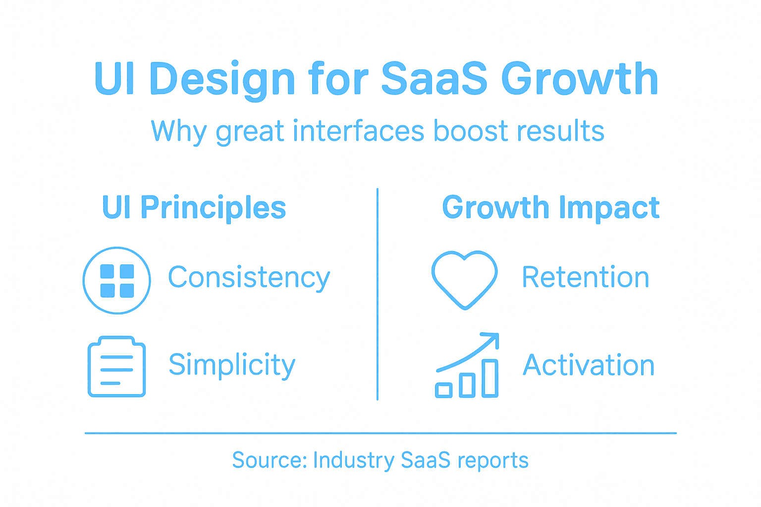
Once you understand user needs, the practical principles that separate good interfaces from mediocre ones cluster around a few core areas. Consistency means users shouldn’t have to relearn how to interact with different parts of your product. If a button appears in one place, it should look and behave the same everywhere. Simplicity means removing every element that doesn’t serve a direct user need. Each extra field, modal, or menu option increases cognitive load. Accessibility ensures your interface works for users with varying abilities, different devices, and different levels of technical expertise. And trust building through clear feedback, transparent error messages, and security indicators determines whether users feel safe in your product. Designing intuitive navigation and maintaining visual consistency directly supports both usability and the sense that your product is professionally built and reliable.
Here’s what actually separates SaaS products that drive adoption from those that generate constant support tickets. The winners obsess over reducing user effort. They test their assumptions instead of trusting them. They measure how users actually behave in the product, then iterate based on evidence. They prioritize accessibility not as a compliance checkbox but as a design philosophy that benefits everyone. A clearer error message helps all users, not just those with screen readers. Keyboard navigation that works smoothly supports power users who never touch the mouse. This mindset shift changes everything. Your interface becomes a tool optimized for user success rather than a reflection of your internal system architecture.
The practical work happens in the details. Form fields should be grouped logically. Buttons should clearly indicate what happens when clicked. Loading states should show progress. Error messages should explain what went wrong and how to fix it. Mobile responsiveness should be designed from the start, not bolted on after. These aren’t trendy design features. They’re the fundamentals that have proven to reduce friction, improve completion rates, and increase user retention across thousands of SaaS products.
The following table summarizes the business impacts of common SaaS UI design principles:
| Principle | How It Helps Users | Positive Business Impact |
|---|---|---|
| Consistency | Reduces relearning curve | Fewer errors, faster onboarding |
| Simplicity | Eases navigation and focus | Higher user retention, lower support |
| Accessibility | Enables all users to succeed | Broader market reach, risk reduction |
| Clear Feedback | Confirms actions, builds trust | Lower support volume, user satisfaction |
Pro tip: _Record 5 to 10 user sessions of customers completing critical workflows in your product, then watch them without narration and note every moment of hesitation, confusion, or failed attempt—these friction points are your highest-impact design opportunities.
How UI Design Drives Product Growth
The connection between UI design and revenue growth isn’t mysterious. It’s mechanical. When your interface removes friction from critical user workflows, users accomplish their goals faster, experience fewer errors, and stay longer. This compounds into better retention metrics, lower churn, and ultimately stronger unit economics. But the relationship goes deeper than just keeping users happy. Focusing on actual user needs and providing intuitive interfaces enhances user satisfaction and engagement, which directly reduces friction during onboarding and increases feature adoption. A SaaS product with powerful features but a confusing interface will always lose to a simpler competitor with a thoughtful interface. Your UI determines whether users ever reach the “aha” moment where they realize your product’s value.
Growth compounds when you measure how users actually behave and iterate based on evidence. Most SaaS teams guess at what users need, build features based on those guesses, then wonder why adoption stalls. The companies that grow faster take a different approach. They test assumptions with prototypes. They watch users navigate their interface. They measure where users get stuck. They iterate relentlessly. Regular user testing leads to refinement of product features and reduces barriers to adoption, which increases retention and creates a foundation for sustainable growth. This isn’t a one-time design phase. It’s an ongoing practice that separates stagnant SaaS products from those that accelerate.
UI design also functions as a competitive moat in crowded markets. When three SaaS products offer similar core functionality, the one with the best interface wins market share and mind share. A thoughtfully designed interface signals professionalism, attention to detail, and respect for user time. It builds brand trust. New users feel confident in a product that works smoothly on their first day, and that confidence converts to longer contracts and higher expansion revenue. Beyond retention, adopting universal design principles enhances inclusivity and significantly broadens market reach, opening your product to larger customer segments and reducing the legal and reputational risks of accessibility failures. Poor UI design also creates hidden costs. Every confusing workflow generates support tickets. Every unclear error message drives frustrated users to your competitors. Every onboarding failure costs you a customer. Good UI design reduces these hidden costs while simultaneously improving visible metrics.
The product teams that win understand this calculus. They invest in UI design not as a cosmetic nice-to-have but as a core growth lever. They embed designers into product decisions early. They test interfaces with real users. They measure what changes move key metrics. They iterate continuously. This approach requires discipline because the payoff comes gradually, accumulated through hundreds of small improvements rather than one breakthrough feature. But the compounding effect is undeniable. Better UI means faster activation. Faster activation means better retention. Better retention means sustainable growth.
Pro tip: _Track activation time from signup to first value for a cohort, redesign your onboarding UI based on user testing, then measure the same cohort one month later to quantify exactly how much design investment improved your growth metrics.
Common UI Mistakes and How to Avoid Them
Most SaaS products stumble on the same handful of UI mistakes, and the painful part is that these mistakes are entirely preventable. The most destructive mistake is building complex interfaces that try to expose every feature at once. You add a toolbar here, a sidebar there, additional options tucked into menus, and suddenly new users feel overwhelmed before they accomplish anything. Overly complex interfaces create friction that compounds daily. Users need to learn too much before they can succeed. They make more errors. They abandon the product faster. The solution is ruthless prioritization. Ask yourself what users need to accomplish on day one, week one, and month one. Hide everything else. Surface features progressively as users develop expertise. This approach requires discipline because you’ll face pressure to expose every capability upfront, but restraint always wins.
Another pervasive mistake is inconsistent design patterns that force users to relearn your interface constantly. A button that appears in one workflow should behave identically in another workflow. Colors should mean the same thing throughout. Navigation should work the same way whether users are in a dashboard or editing a record. Ensuring consistency in visual and interaction design improves learnability and reduces user errors. When consistency breaks, users second-guess themselves. They click things hesitantly. They miss features because they don’t recognize them in new contexts. The fix is establishing and enforcing design systems that mandate consistency. This takes upfront investment but eliminates countless downstream problems. Poor accessibility is another major stumbling block that many teams deprioritize until legal pressure forces action. Inaccessible interfaces exclude users and create liability. But beyond compliance, accessible design benefits everyone. Larger text helps users in bright sunlight. Keyboard navigation helps power users who never touch the mouse. Clear color contrast helps users with color blindness. A user-centered design approach that engages users throughout development ensures accessibility isn’t an afterthought bolted on at the end.
Lacking sufficient user feedback is another common mistake. Users shouldn’t wonder if their action worked. A form submission should confirm success. A long-running operation should show progress. An error should explain what went wrong and how to fix it. Silent failures destroy trust and drive support tickets. The fix is simple: audit every user action and ensure it receives clear feedback. Loading states, confirmation messages, progress indicators, and descriptive error messages should be standard. Many teams also skip user testing entirely or test only with internal users who already know the product. Real users behave differently. They attempt things you never anticipated. They get confused by things you assumed were obvious. Testing with diverse user groups throughout development prevents expensive redesigns later.
Pro tip: _Identify your three most critical user workflows, test them with five external users who have never used your product, document every moment they hesitate or fail, then fix those friction points before adding any new features.
Elevate Your SaaS Product with Strategic UI Design Leadership
Struggling with complex interfaces that confuse users or inconsistent design patterns that slow adoption You are not alone Many SaaS teams face these exact challenges outlined in the article on User Interface Design for SaaS Success Achieving simplicity consistency and accessibility requires more than design tweaks It demands embedded senior design leadership who understand how to co-create with your product and engineering teams to drive measurable growth
Unlock faster user activation and higher retention by partnering with The Good Side We specialize in providing fractional senior design partners who integrate seamlessly into your workflows to solve your most critical UI challenges Our approach focuses on clear business outcomes from onboarding to go-to-market experiences so you focus less on costly redesigns and support tickets and more on sustained revenue growth Start transforming your SaaS UI today Visit The Good Side to discover how outcome-driven design can accelerate your product growth and user satisfaction
Frequently Asked Questions
What is user interface design in SaaS?
User interface design in SaaS refers to the process of creating the screens, buttons, icons, and layouts that users interact with in a cloud-based application, ensuring that these elements are intuitive and facilitate user goals without friction.
Why is user interface design important for SaaS products?
User interface design is crucial for SaaS products because a well-designed interface enhances user experience, reduces friction, and can significantly impact user retention and satisfaction. A confusing interface can lead to users abandoning the product before discovering its full capabilities.
What are the key principles of effective SaaS UI design?
Key principles of effective SaaS UI design include consistency, simplicity, accessibility, and clear feedback. These principles ensure that users can navigate the interface easily, understand its functions, and complete their tasks with minimal confusion or errors.
How can UI design drive growth for a SaaS product?
UI design drives growth by removing friction from user workflows, allowing users to achieve their goals more efficiently. This results in better retention rates, fewer support requests, and a greater likelihood of users discovering and using additional features, ultimately contributing to sustainable revenue growth.
Recommended
- 7 Types of SaaS Design Every Product Team Should Know | The Good Side Blog
- The Essential Guide to the Role of UI in SaaS | The Good Side Blog
- Complete Guide to the Role of UX in SaaS | The Good Side Blog
- How to Design Intuitive Interfaces for SaaS Success | The Good Side Blog
- Samtouch Office - YCR Distribution - UKs Largest Independent POS VAR.